RETRO FILM
I got the opportunity to create a new visual identity for my dads film digitisation company. Here I
wanted to play on the nostalgic and joyful feeling of old memories.
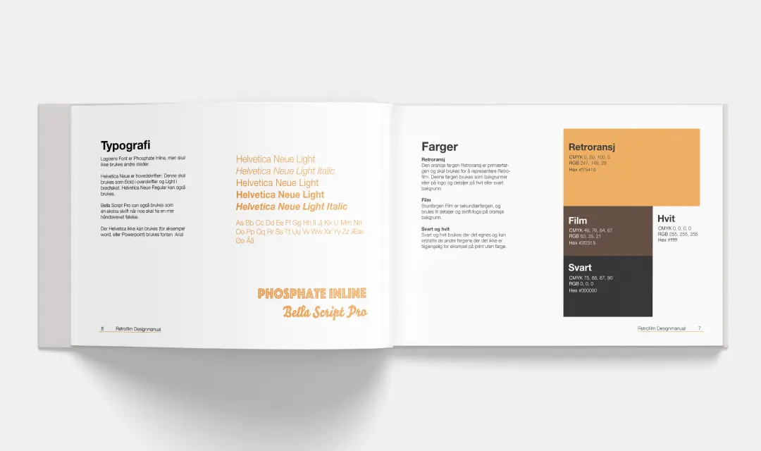
I chose the color orange for the warm joyful feeling, and paired it with brown for the perfect
70s match.
NOSTALGIA IN THE DETAILS
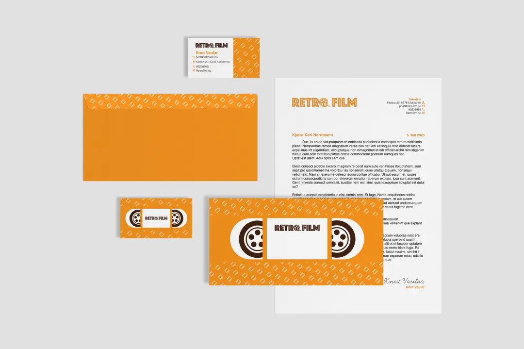
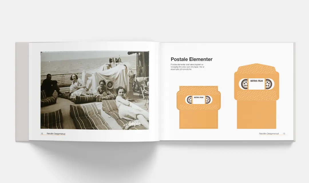
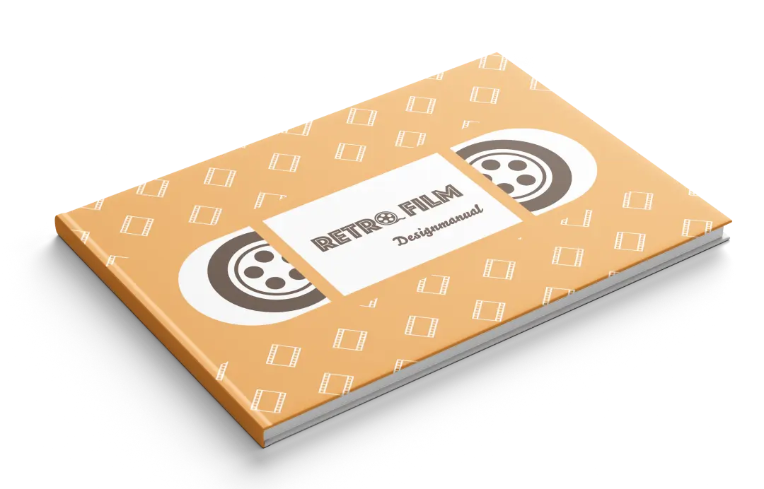
All of Retro Film is about film. The O in the logo being a film roll, the film pieces in the pattern, and the VHS tapes in the business cards, Envelopes and on the design manual itself.
VISUAL IDENTITY MADE EASY
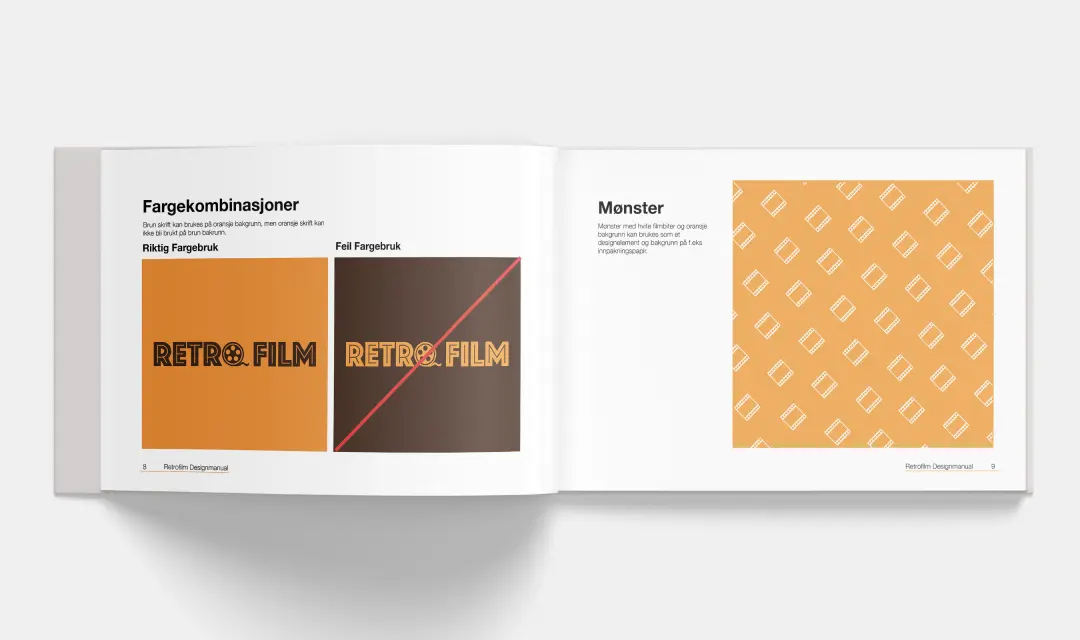
I made postal elements, the logo, and a design guideline book to make it easy for my dad to create visually appealing, informative and advertisement content. Here I included colors, do’s and don’ts, logos, clear space, patterns, and image styles.
