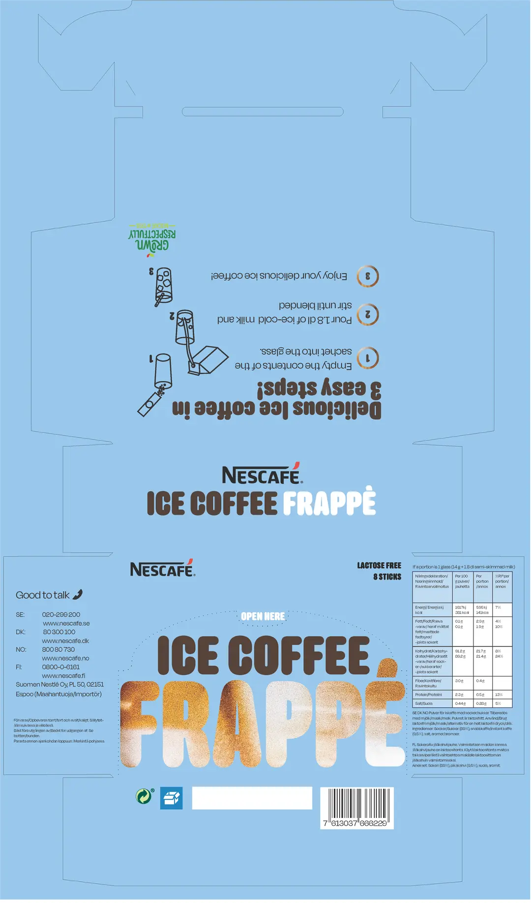
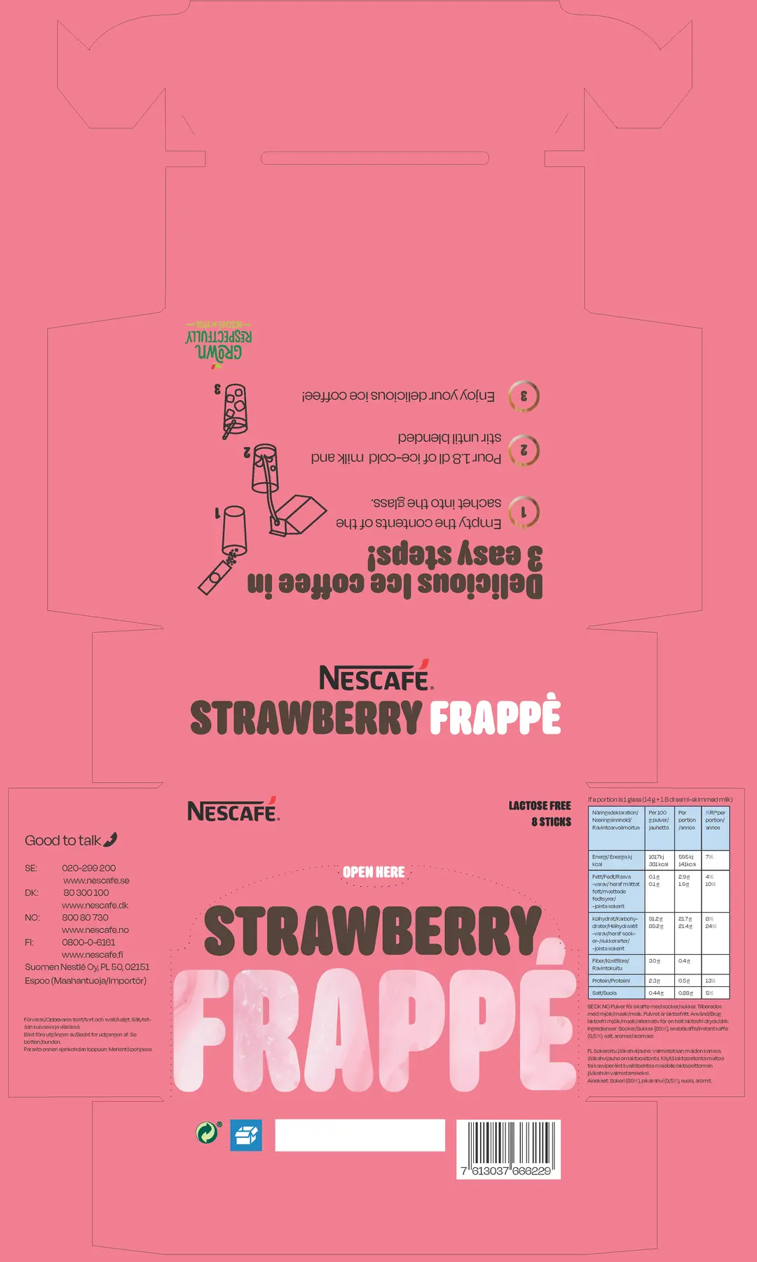
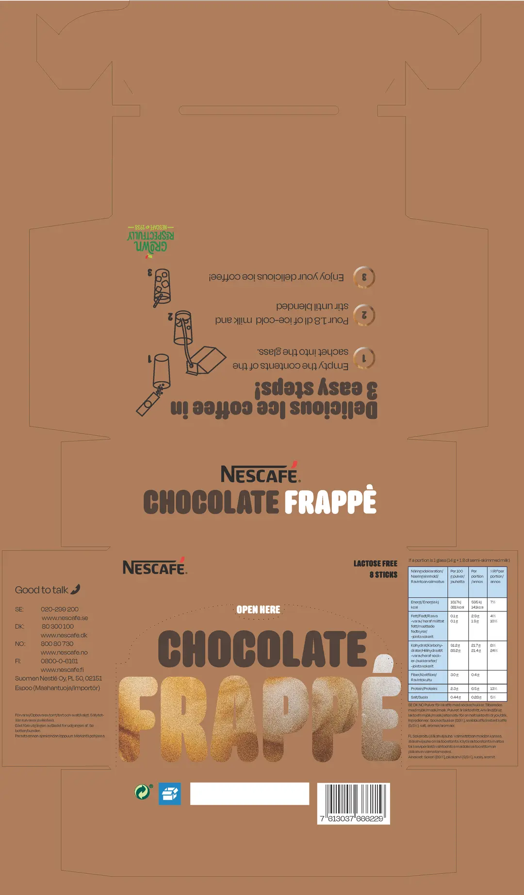
PACKAGING REDESIGN
This school assignment was to redesign packaging and add three more variants to the product. I chose to redesign Nescafés Ice Coffee Frappé packaging based on it looking outdated and the design being unintuitive.
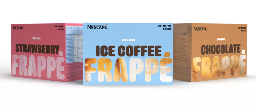
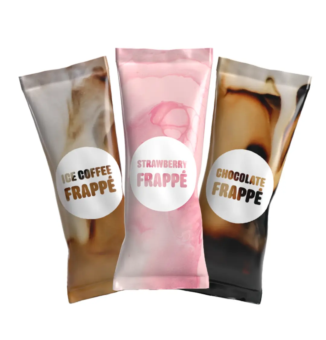
COLORS THAT POP AND APPEALING BEVERAGES
Using bright colors in the design was very important as the target demographic is in the age-group 17-25. It was also important to show the product in a creative, fun and appealing way.
FUN TYPOGRAPHY
Fun is the core value of this redesign and the typography is no exception. Here we show the product in an interesting way buy incorporating it into the text.

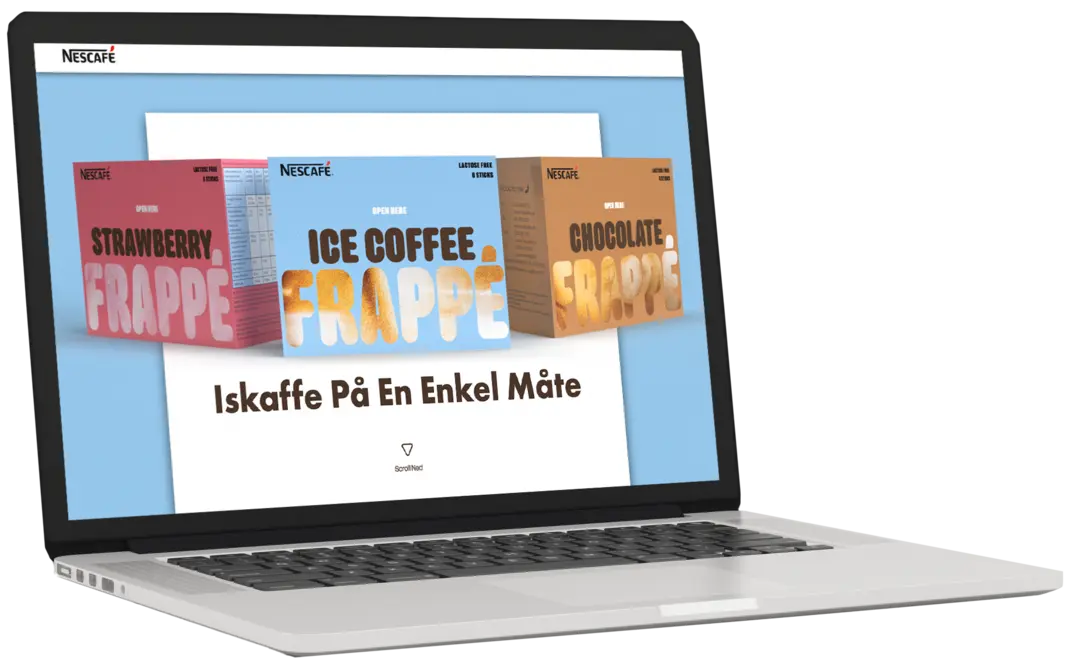
CAMPAIGN WEBSITE
This assignment was my first introduction to HTML and CSS. Our job was to create a campaign website
for the packaging we had redesigned previously.
I chose to use the same colors and themes on the website as I had used on the packaging.
Click here to get to the website